|
 |
RSS Feed  |
a playground of art, photos, videos, writing, music, life |
|
|

You are here
|

Creativity!
|

Get it!
|

I like it!
|

Fun stuff!
|

About me...
|
| |
|
|
|
|
Random Quote
The fewer the words, the better the prayer.
-- Martin Luther
|
|
|
|
|
|
The Story of "Drawing and Painting"
Home Page
Blog Archive by Month | Blog Archive by Story or Tag | Search Blog and Comments
Hue, Value, and Intensity |
 Betty Edwards writes in her book, Color: "Everything about color has to do with relationships, and the questions you need to ask in order to understand color are all about relationships." Betty Edwards writes in her book, Color: "Everything about color has to do with relationships, and the questions you need to ask in order to understand color are all about relationships."
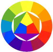
What you see at right is a color wheel. If you start with the three primary colors, and then add the secondary colors (giving you six colors), and then add the color that is a mixture of the adjacent primary and secondary colors, you then have twelve colors. What combinations of colors please the eye? Studies have found that opposites do. For example, purple and yellow, or red and green. To show that this is true, several people have complimented my current painting, a still life of a red pepper and a sliced red onion. The red pepper is a bright red with a green stem. The onion is purplish with yellow highlights. This was quite by accident on my part - I was simply painting what I saw. But as I step back from it, I do see that aspect. Artists also find that triads - creating a color and then using the fourth from it and then the fourth again - creates a harmonious mix. Red, yellow, and blue are one example. Orange, purple, and green would be another. I doubt that it has anything to do with this, but music also has twelve notes between octaves. To create a harmony, you use not the opposite or triads, but rather fifths or sevenths. But there's a rhyme and a reason to understand harmony in both color and music. So... I wonder how this idea of hue (a color from the color wheel), value (light or dark), and intensity (bright or dull) transfers to harmony in friendships and marriages. I'm too tired now to consider it more, but I'll be thinking of it... ETC: More in the comments... |
|
|
I bought Richard Schmid's book, "Alla Prima." Easily the best book on the making of art that I've read. Conversational in its tone and deep in its treatment of art, truly a treasure from a man who loves making art. I want to quote his discussion of drawing. It's everything that I would want to say, but he says it far better and with more authority. Emphasis in bold is mine... Enjoy :) There is a popular notion that artists are born with an ability to draw, but that isn't true. The impulse to draw is there, but no one arrives in this world endowed with the capacity to graphically depict visual reality. I have never known a painter who was just "naturally" good at it and could do it without serious training. Drawing is a skill that must be learned, but it isn't like swimming or riding a bike. Once you get the knack of it, you can't relax and just let it happen by itself. It takes constant practice and presence of mind. Why? Because it is not a physical skill; it is a mental discipline. It deals with continual variables rather than the repetition of memorized shapes. I always have the fond hope that someday it will get easier, but it never does. Sound drawing always demands great care right down to the last dab of paint.For most of us, the word "drawing" brings to mind an outline of something. This deeply ingrained assumption originates in childhood when we learned to use lines to make pictures. Yet in real life there are no lines around things. Line drawing is only a representation or diagram of our visual world. Painting, on the other hand (the kind I am dealing with here), attempts to create an illusion of that world. Consequently, in this discussion when I use the word "drawing," I mean the size, shape, and arrangement of all the patches of colors that collectively make things look the way they do (and which also constitutes a painting). When you render those patches the right size, the right shape, and with their distinctive edges and color, your painting will look like your subject. If you don't - it won't. It will look different. Drawing is simply measuring. As it applies to direct painting from life, drawing comes down to nothing more than figuring out the width and height of color shapes and then fitting them together. Still, drawing remains very difficult for nearly everyone, which is odd when you think about it because drawing is only the visual element we work with that seems to deal with a measurable and definable aspect of the visual world. The other three elements: color, value, and edges, are relative qualities with generous room for interpretation. Drawing is about specific dimensions. That, folks, is a masterful explanation of drawing. And if you like painting, or want to paint, buy the book. It's cheaper and available in soft copy at his web site, which is where I bought it. |
|
|
Take a look at the following image:  Could you draw that? I suspect that just about anyone could draw a line that looked reasonably similar to it. How about this one?  A little more difficult, but I still believe that almost anyone could come very close to drawing lines that looked like these. Now here's the thing - these are taken from a larger picture that I've broken up into squares. This is the entire composite: 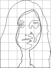 If I removed the grid, it might seem harder to you to freehand draw it. But broken into a grid, it appears much easier. In fact, I suspect that if I left the grid in place, most people would see their way to a step-by-step, or should I say square-by-square, approach to draw this woman. If I had started by asking you to draw the woman shown below, and you didn't believe that you had any skill in drawing, you might have balked.  But if you know of a method that allows you to get there, line by line and step by step, you could then believe it. Here she is "painted," or colored in from the wireframe squares image shown above.  If you had painted such a picture of her, how would you feel about your talent? Painting isn't about talent. It's about knowing the process and then doing it. It's my opinion that anyone can draw and/or paint. Those who wish they could but don't think that they can just need to know how. |
|
|
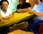
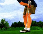
Drawing with a pencil is much harder, in my opinion, than drawing with paint. With paint, I can choose the shades of colors to represent darker areas. Green looks like green and red looks like red. Not so with pencil. Pencil is a gray world. And you can't fill an area with pencil like you can paint. Pencil is also a world of lines. Fat lines, maybe, if you lay the pencil's tip on its side, but it's still lines. Drawing is the root of all painting, and so practice is important. For me, it feels like exercise first thing in the morning. I get up, I don't want to do it, but I know it's good for me. I mentioned that last night I drew while at the playground with Jacob. Here's what I drew: 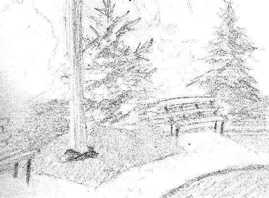 My scanner muddies this up a bit, but you get the idea. And here's the actual picture: 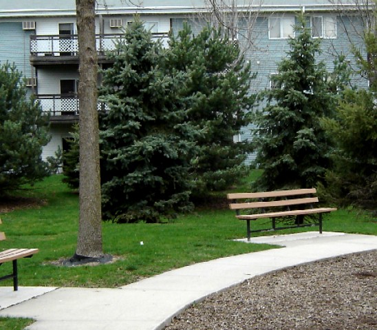 When I draw from a photo, it's much easier to "measure," or compare distances. But it's much tougher when viewing it live. You can see how I skewed the bench, in particular the bench on the right. Where did those curves come from? Trees give me fits. So much texture and complex shading... how do you do that with a pencil in a sketch and make it look real? More good practice. So today, Cub and I went back to the playground. After playing for a while, I went back to the bench and started to sketch this tree: 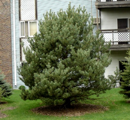 And here was what I did: 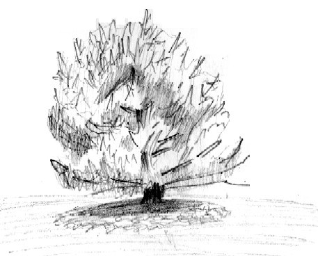 I'm not happy with it, but again, it's all good practice. For what it's worth, if you enjoyed the bike ride video last week, here's another one, which is a short ride through my apartment complex. I came home from my little bike ride and found my son and his girlfriend playing their new favorite game together, Boggle. They had this layout: 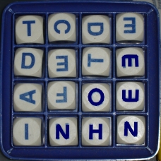 Boggle is a great game. The key to big points is how you look for suffixes and prefixes that lead to larger words. They're learning this, but with this layout, they only managed a few 5-letter words and the rest were smaller. New to the game, they couldn't see these two 6-letter words: 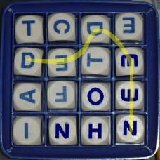 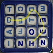 The more I think about it, the more it seems to me that how we see things is the key to success, whether it be painting or management or Boggle - whatever. The techniques, once known to us, don't really require great skill of any kind that we don't already have, but simply practice in how to see things in a way that helps us to our goal. It's a good Sunday... |
|
|
 | Drawing: Examples of the Grid |  |
The other day, I mentioned a gridded approach to drawing that helps to ensure accuracy and provides a method that just about anyone can follow. If you're getting started and you don't think you can draw, a grid can make it easy. And even if you're not getting started, you're in good company if you use such a system, as I'll show here. 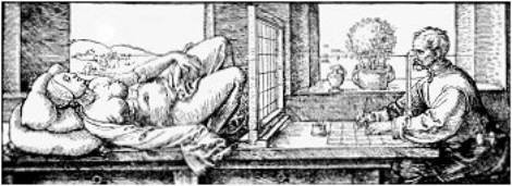 This was done by Albrecht Durer, and it's called "Draughtsman making a perspective Drawing of a Woman." He shows a wireframe window through which he views the subject of the drawing. The grid allows him to get the proportions correct as he draws the outline of the figure. This was done in 1525. A college math major did a paper that linked math to art. They said this: Alberti is known for introducing the approach of using drafting lines to create grids to guide the creation of life-like perspective and proportion. Leonardo Da Vinci worked on an instrument he called a "trellis work" that assisted artists in placing subjects realistically in conjunction with each other and relative perspective. In Germany, an artist named Albrecht Durer, worked with a method of transferring small drawings accurately to larger sizes using his grid system. Grids are still in use. Here's a wonderful example: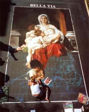 You can clearly see the chalked grid in the unfinished part of the street painter's work. Notice in particular the outline of the child curled up on the lower right. Let's take a closer look. 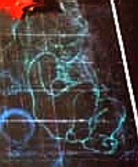 Now just look at the individual squares. I'll enhance it to help with that. 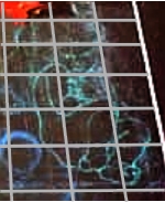 Broken down to the square and early chalk outline, this beautiful work of art doesn't seem so impossible to do. If you can use such a system to get the proportions correct, and if you can select colors, then you can most likely paint. I hope this thread on drawing helps to spark some possibilities for those who would hesitate to try their hand at art. It's just a matter of knowing the right steps to getting there. |
|
|
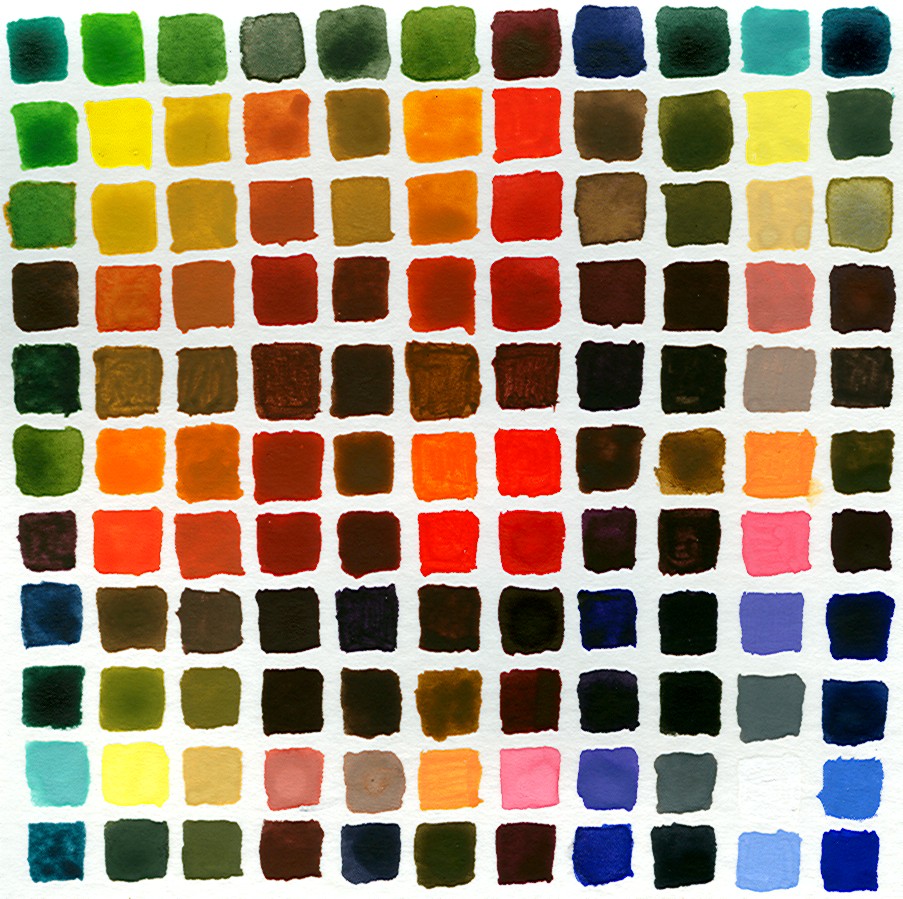
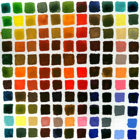 As I mentioned a couple of days ago, after reading Richard Schmid's book on painting, I decided to explore my palette of colors further by mixing each color with each other color and setting the individual swatches side by side. What you see above is that effort. If you start in the upper-left corner and move diagonally to the lower-right corner, that line of swatches is that of the "native" colors, which are: - Viridian (blue-green)
- Cadmium Yellow Pale
- Yellow Ochre
- Burnt Sienna
- Burnt Umber
- Cadmium Orange
- Grumbacher Red
- Violet
- Ivory Black
- Chinese White
- Ultramarine (blue)
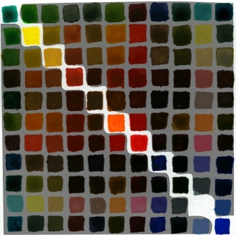 So for each column and row that a native color is found, it has been mixed with every other color and in order. To explain, the 4th row and the 4th column are all colors mixed with Burnt Sienna. The first color mixed would be Viridian, the second Cadmium Yellow Pale, and so on. 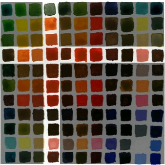 I'm now strongly of the opinion that every painter should do this. I learned a great deal about the strength of some colors, such as red, to easily overpower another color when mixing the two. Color harmony also becomes more obvious by doing this. I noticed that if you take any four adjacent colors, they create a nice harmony. Doesn't matter which colors. Here's an example: 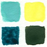 Here you have White/Viridian and White/Cadmium Yellow Pale on the top, and then on the bottom, Blue/Viridian and Blue/Cadmium Yellow Pale. These work together. Here are a few others: 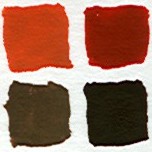 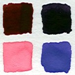 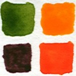 It's because they have colors in common that tie them together. That tie of colors together creates a transition that our eyes can follow. In my first example, I get from White/Viridian to Blue/Cadmium Yellow Pale through White/Cadmium Yellow Pale and Blue/Viridian. Seeing this helped me to understand Schmid's concept of Edges better. An Edge is the transition from one color to another. It can be rapid or slow, steep or shallow. But as long as it is a migration that makes sense in terms of color changes, the eye will accept in a painting. (Further, Edges will define the depth in a painting as much coloration will. I didn't understand Schmid's point about this when I first read it, but I do now. A stark color transition will insist that there is separation between objects. A person standing in front of a building needs no color transition with the building because there are separate. But when painting a face, there can be no harsh absence of transition, or the face will not appear right to us.) If you've ever used Photoshop and Microsoft Paint (or Paintbrush), you know the difference between unrealistic edges and realistic edges. Photoshop will produce gradual transitions to another color, as this zoomed-in movement from orange to white shows:  Edges are "smoothed" in Photoshop. Not so in Paint. There you'll see hard edges driven by the pixel. Hence the term, "pixelation." I've found that I really like the series of colors that share a base color. I plan to explore that more. And I want to use this as an occasional guide when reaching for a color... I was surprised by some of the colors created. Cool exercise. |
|
|
Today, I had to take Nick to the local craft store to get some things for his girlfriend, and while there, I picked up four brands of acrylics paint, all raw umber. - Grumbacher Academy
- Golden
- Winsor & Newton Finity
- Liquitex Heavy Body
I had no expectations going into this. I currently own Dick Blick, and the paint has been adequate, but the tube of Dick Blick's raw umber that I have looks like curdled milk when it comes out of the tube. Needing a replacement, I saw this as a great opportunity to find a brand for my future purchases.My criteria for determining a good paint is that it should be consistent, smooth, but heavy enough that it doesn't lose its color when a brush cuts into it, once applied. In other words, if I paint a stroke, I expect the paint to stay where I put it. And how well can I paint a thin line with it? Let's find out! Here are my results, from worst to best:  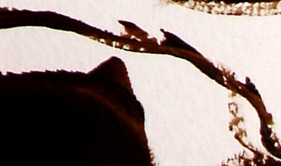 Worst: The Liquitex had very creamy quality to it, but when painting, as you can see, subsequent brush strokes would cut into my previous brush strokes. Once I paint something, I expect it to stay put. Not true with Liquitex. The lines also show the weakness of the paint. Next worst, surprisingly (given all their hype in the art community), was Winsor & Newton. 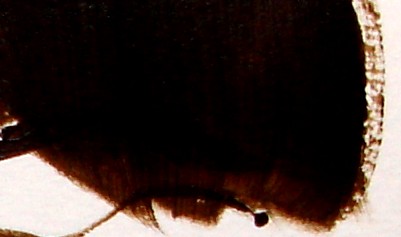 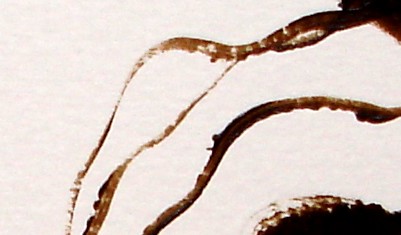 I found that I constantly had to paint over an area to make it keep its color. The brush slices right through the applied paint. You can see this in the example swatches above, especially in the lines... that's just awful. Both of these paints, the Liquitex and the Winsor & Newton Finity, had a lighter brown appearance than the other two paints, and they fared poorly by comparison. This suggests that maybe they put too much water in the paint that it won't hold up to actual, you know, painting. Next, Grumbacher Academy, which was the least expensive of the tubes that I bought and is supposedly a student quality of paint, and yet, it was nearly as good as the best of the brands that I've now tried. Here's the Grumbacher swatch: 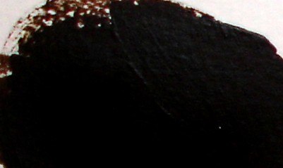 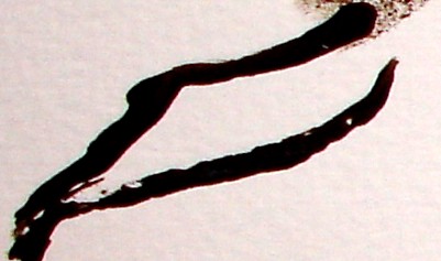 Smooth, even color. When painting on the edges, it wouldn't sink into the texture of the paper, but when painting over a previous painted area, the acrylic didn't budge. A fine paint, to be sure. Grumbacher is a brand that I've used for watercolors and have always enjoyed their paints, so I was pleased by the results of this test. And the lines are strong. And the winner, even by those in my house who didn't know my criteria: Golden 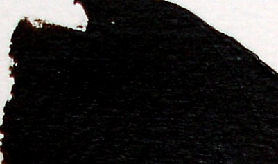 Not only did what I paint stay just as it was when I first laid it down, but the edges sunk into the paper's texture for an even look. Further, it even had the best lines.  I could go thin with the line and the paint still held up well. So, I've tried five brands of acrylics, and the clear winner was Golden, which I highly recommend. And if you're on a budget, Grumbacher Academy is a great paint for the price. |
|
|
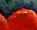
Over the weekend, I went over to Erin's house and we painted for a few hours. And we laughed a lot. Which was very therapeutic for us both - not to say that we needed it, but the company and the whimsical atmosphere were delightful.  What is it? I don't know... and it doesn't matter. It's "Sunday," painted without thought and in joy. And this one...  Painting has become a favorite way to spend time with friends, just goofing around. It's color and kindergarten. Fun :) I hope to do more of this with those of you who browse the site and would be open to painting with me. Especially as I get into the breakneck pace of February, it will be great to offset the seriousness of producing cards with the fun of the brush while hanging with friends. ETC: "Skinny Jeff" stops by and leaves a comment overnight. He has a web site (I won't link to it, but he lists it and you can click into the comments to see it) and he asks me to visit it and link to it. Because his site is at least relevant (art), I won't consider it spam, but that's kind of what he's done. My trivia mechanism has curtailed all of the bot spam. So I go to his site and it's a lot of text (and Google ads) about learning to paint. Not much of it is really very helpful... nothing demonstrated in a step-by-step method or anything. He kind of talks around the subject without explaining how. And then the irony... in this post, which discusses how I just willy-nilly painted with Erin over the weekend, he posts a comment, when at his web site, he says this: "Often people with a certain artistic predisposition think that all they need is paper or a canvas, brushes, paints of different colors, and off they go to the path of artistdom!" Hmm... well, that's pretty much what Erin and I did. It was carefree painting with no artistic agenda other than to have a good and judgment-free time.I respect his desire to make a buck, and I wish him the best, but for anyone who wants to paint or draw, my favorite books are as follows: Those are my recommendations.On the other hand, if you just want to enjoy painting for the fun of it, with no real serious agenda, I recommend Life, Paint, and Passion. |
|
|
I found a way to prevent using excess acrylic: paint cups. 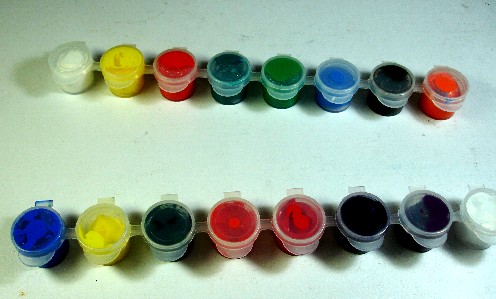 I squeeze a bunch of paint into these cups, and the lid keeps them from drying out. When I'm ready to use some paint, I scoop only what I need from the cup and onto my palette paper. That, and cling wrap, once the paint is on the palette paper. Big cost savings and it allows me to take breaks, which are always healthy. |
|
|
| | | | |
What I Know About Painting: 10 11 Tips |
I've only been painting a short period of time, but I've got some tips and tricks for anyone who might want to hear. I figured while I'm home today with a sick child who is now resting, I might jot these down. Tip #1: If you want to paint, then paint! I know it sounds silly to have to say it, but it's much like Virginia Woolf said: "The art of writing is the art of applying the seat of the pants to the seat of the chair." The same is true of painting. If you want to accomplish something, then first move to the place where you would do it, and then do it. Tip #2: Embrace fear. I feel inadequate to work with quality on every painting that I begin. It's true. But I ignore it and dive in anyway. Tip #3: Embrace "failure." I'm okay with failure. Neither success nor failure define a person, but the effort. And my past success is no indication of my future result. In fact, success can heighten my expectations and intimdate me from trying. To hell with that. Tip #4: Paint exactly what you see. Painting itself is not a matter of dexterity. It's 50% a matter of seeing things truly. (The other 50% I'll get to in a moment.) But it rests in the ability to see things as they really are. That apple might be red in parts, but it is a wide array of colors in the spectrum if you really look at it as it truly is. Tip #5: Learn colors. Mix colors. Take every color in your palette and mix each with the others and learn the combinations of them. Learn which ones are weak and semi-transparent and which ones are strong and opaque. Color is such a powerful tool in an artist's hands. This is the other 50%. Whatever else follows is style, I think. Tip #6: No black. I left black out of my color palette a long time ago, and I'm much better for it. If I need "black," I mix deep browns (blue-orange, purple-yellow, red-green) or I mix blue and green and red together. Or I use a strong purple. But each of these have a warmth to them, and frankly, "black" just isn't in the world. It's flat and lifeless. Seriously. Look around. It's hard to find. Tip #7: Limit your palette. Paint harmonizes better with fewer colors. I generally start a painting by choosing the 4, or at most 5, colors I plan to use. White is always present, but I try to use it sparingly. It pulls the life from a color when mixed. Tip #8: Learn composition. The more the eye darts around the painting, the more interesting it is. If something is front and center, like a portrait, there's no discovery or movement. Tip #9: Less is more. If the brain has to work a bit to assemble the painting and fill in the blanks, the more drawn people are to it, in my opinion. I'm not talking Jackson Pollack in terms of making the brain work, but an exact replica of life doesn't require any imagination or bend us in any way. Like people, a painting becomes more interesting when it's not "perfect." Tip #10: Mix up your subject matter. Try new things. Paint trees, people, animals, houses, nature... enjoy the challenge of new subject matter. Tip #11 Get rid of the yellow lights. Look at the difference between a true artist's white light and the light bulbs you buy at the store. I don't care how "white" the store bulbs purport to be - they're not white. True, white bulbs are expensive, but oh so worth the cost. |
| | | | | |
|
|
|
|
|
|
|