|
 |
RSS Feed  |
a playground of art, photos, videos, writing, music, life |
|
|

You are here
|

Creativity!
|

Get it!
|

I like it!
|

Fun stuff!
|

About me...
|
| |
|
|
|
|
Random Quote
Writing is manual labor of the mind: a job , like laying pipe.
-- John Gregory Dunne
|
|
|
|
|
|
Blog Posts for "richard schmid"
Page Through Blog: Home Page
Blog Archive by Month | Blog Archive by Story or Tag | Search Blog and Comments
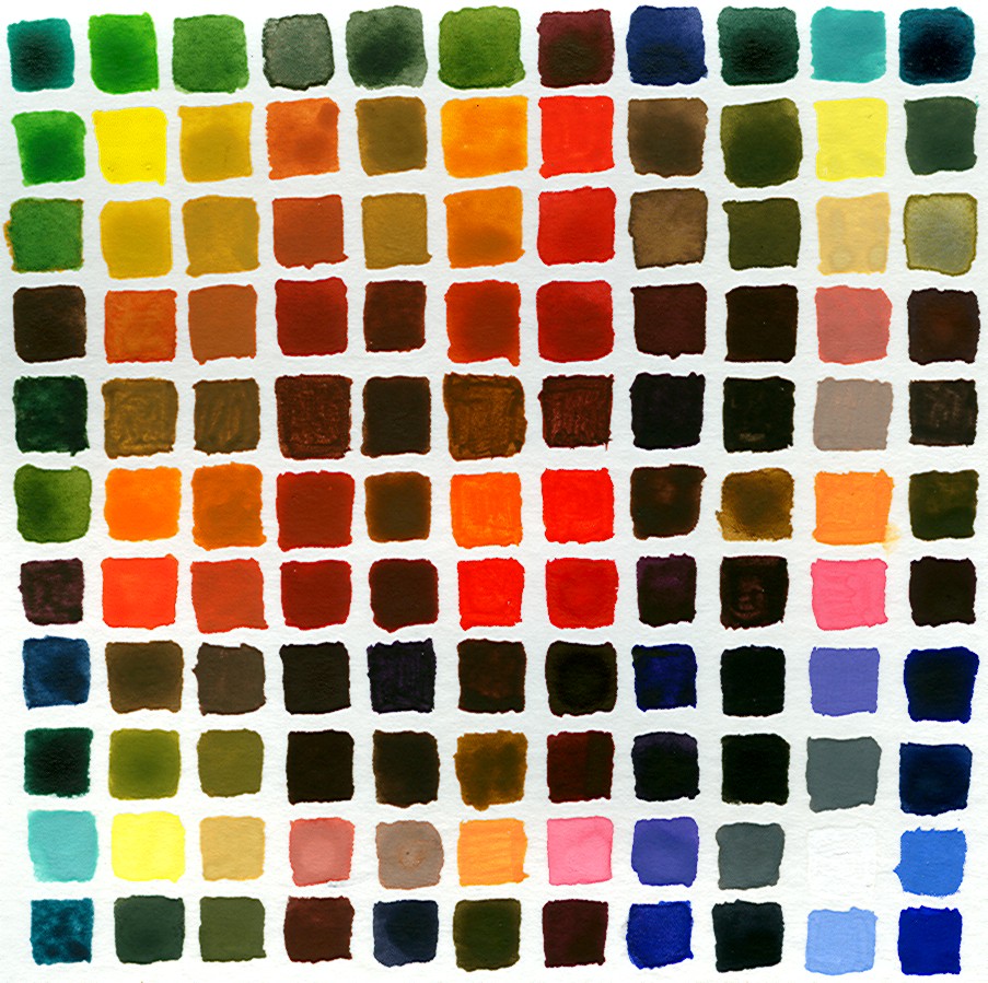
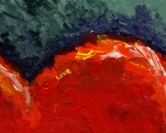
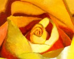
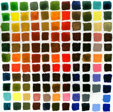 As I mentioned a couple of days ago, after reading Richard Schmid's book on painting, I decided to explore my palette of colors further by mixing each color with each other color and setting the individual swatches side by side. What you see above is that effort. If you start in the upper-left corner and move diagonally to the lower-right corner, that line of swatches is that of the "native" colors, which are: - Viridian (blue-green)
- Cadmium Yellow Pale
- Yellow Ochre
- Burnt Sienna
- Burnt Umber
- Cadmium Orange
- Grumbacher Red
- Violet
- Ivory Black
- Chinese White
- Ultramarine (blue)
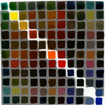 So for each column and row that a native color is found, it has been mixed with every other color and in order. To explain, the 4th row and the 4th column are all colors mixed with Burnt Sienna. The first color mixed would be Viridian, the second Cadmium Yellow Pale, and so on. 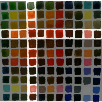 I'm now strongly of the opinion that every painter should do this. I learned a great deal about the strength of some colors, such as red, to easily overpower another color when mixing the two. Color harmony also becomes more obvious by doing this. I noticed that if you take any four adjacent colors, they create a nice harmony. Doesn't matter which colors. Here's an example: 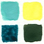 Here you have White/Viridian and White/Cadmium Yellow Pale on the top, and then on the bottom, Blue/Viridian and Blue/Cadmium Yellow Pale. These work together. Here are a few others: 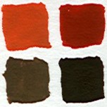 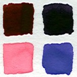 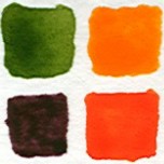 It's because they have colors in common that tie them together. That tie of colors together creates a transition that our eyes can follow. In my first example, I get from White/Viridian to Blue/Cadmium Yellow Pale through White/Cadmium Yellow Pale and Blue/Viridian. Seeing this helped me to understand Schmid's concept of Edges better. An Edge is the transition from one color to another. It can be rapid or slow, steep or shallow. But as long as it is a migration that makes sense in terms of color changes, the eye will accept in a painting. (Further, Edges will define the depth in a painting as much coloration will. I didn't understand Schmid's point about this when I first read it, but I do now. A stark color transition will insist that there is separation between objects. A person standing in front of a building needs no color transition with the building because there are separate. But when painting a face, there can be no harsh absence of transition, or the face will not appear right to us.) If you've ever used Photoshop and Microsoft Paint (or Paintbrush), you know the difference between unrealistic edges and realistic edges. Photoshop will produce gradual transitions to another color, as this zoomed-in movement from orange to white shows: 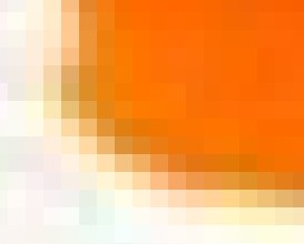 Edges are "smoothed" in Photoshop. Not so in Paint. There you'll see hard edges driven by the pixel. Hence the term, "pixelation." I've found that I really like the series of colors that share a base color. I plan to explore that more. And I want to use this as an occasional guide when reaching for a color... I was surprised by some of the colors created. Cool exercise. |
|
|
Lots of things going on in my personal life, and so I'm up late trying to accomplish one thing that I wanted to do today, which was to work on my palette color selection and mix some paint. I've learned from reading and from practice that it's not hard to mix any color that you need, but it is hard not to get all excited about the 89 colors that paint vendors push at you. No one actually needs all of those, and with a bit of practice, in theory, a person should be able to mix any color from a good selection of base colors. Tonight, I worked orange. I mixed it with every other color in my initial palette and was surprised by the results. Here are the colors that I first selected in my palette (plus white and black, not shown in this picture). Orange is on the left.  Now on the top row, here are the same colors mixed with orange, with white and black on the far right. The original colors are on the bottom row. 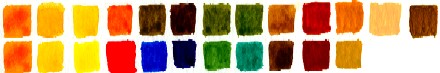 What struck me about this is how similar the results for the greens and for gamboge and yellow (2nd and 3rd on the left). So do I need them? I tried to recreate gamboge (yellow-orange) and sap green (the green on the left) with the other colors. Here's how I did: 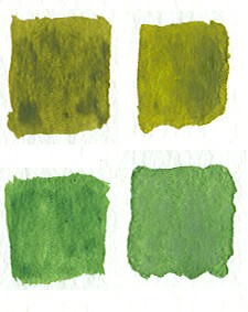 I used viridian, a bit of blue, and yellow to reproduce sap green. I came real close. Then I mixed it with orange to reproduce the blend and that too was very close. So I don't need sap green. 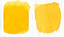 And the same results with gamboge, although I like gamboge as a color. One last thing that I want to point out. Richard Schmid, in his book, asserts that colors harmonize just fine when blended with every other color in a palette. So here are the colors I made by blending every color in my palette with orange.  I have to agree with him. Just having the same "base" color for every mixed color brings out colors that all harmonize with one another. Color wheel be damned. |
|
|
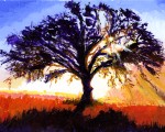
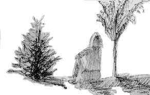 The boys and I went to a park today. Twice. The first time, Jacob had his old three-wheeling bike. Time for an upgrade - so we went to target and bought a two-wheeler. He'll be my last child to learn bicycling from me. Sigh... But when we went to the park, I took my sketchbook with me. A woman and her family were at the playground, and I did a fast rough sketch of her and the two trees that bookended her. I've come to believe that sketching is vital to my art. I need to practice, every day if possible. Earlier in the day, Cub and Nick and I went to Barnes & Nobles and I bought The Ultimate Book of Sketching. It's out of print, but B & N had four copies of it. It's a decent book, not so much on method, but for all of the examples the artists display. I've finished Richard Schmid's book on painting. Truly great book. I've tried my hand at painting and I've never had any formal training, so I've been reading voraciously to give me as much of the essence of it as I can muster on my own. Major influences so far would be Schmid, a watercolorist named David Becker, and Betty Edwards, who wrote Drawing on the Right Side of the Brain and her book on color. The good thing about the three of them is how much they disagree with each other. Becker's watercolors are effortless. He's what I would term a natural artist. Obviously, his "natural" ability is well-honed and practiced. He's a huge advicate of sketching and believes deeply in using initial sketches as a blueprint for composition and values (depth of darkness/brightness). He's unafraid to change a picture to get a better composition. He'll add people, change buildings, and completely ignore the picture's original colors to arrive at what he feels is the best and most interesting painting. Then there's Schmid, whose method is Alla Prima, or paint what you see in one sitting. He doesn't change colors. He paints it as it is, and he's quite ardent about that. Schmid's theory about color is to find a pallete that is true and then learn to blend the colors. He has a fantastic color chart near the end of the book that show how the colors of his pallette blend with each other, and he insists that everyone do this. I see wisdom in this and I'll be doing that myself in the next week or two. He goes into some depth about form (the shape of objects), value (the shading of objects), colors, and edges (the way in which colors and forms meet each other in a painting). Schmid's compositions are fairly straightforward - the subject of the painting is generally at the center and not surrounded by much else. He emphasizes the skill of drawing, like Becker. But he couldn't disagree more with Becker and Edwards about color. Becker and Edwards talk about color harmony. Becker's favorite three colors are purple, green, and yellow-orange; you see them prominently in just about every painting he does. Edwards spends a great deal of time in her book on color discussing how we naturally see harmony in certain colors. Schmid says that's all bullshit. He believes that lighting forces everything into a harmony of sorts. For example, moonlight will blend everything into a pleasant harmony under its spectrum. Sunlight, same thing. I like both perspectives on the subject. I'm too new at this to really have an opinion yet, but again, I'm busy fact-gathering to be as effective as I can be. Where Schmid really differs with the other two is on the topic of edges, and you can really see this in his paintings as well. I've browsed a lot of art books in trying to find ones that would help me understand better and enhance my work to bring out best what it is that I can do. Schmid's comprehensive treatment of edges is unique. Even he says as much in his book. Becker goes into edges a little in one book that I have, but I think watercolors are meant to blend more so that oil can. So are edges in watercolor not as important? I don't know. I do know that Schmid's work is amazing for what it achieves. The idea that he does his paintings, in oil, in a day knocks my socks off. So I've been thinking about all of this. My version of art training... and now my book on sketching to browse and keep me motivated. 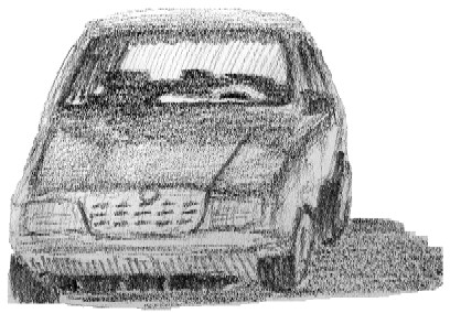 I have noticed that drawing from life is much harder than drawing from a photo. The photo comes with measurable sides and it's easier to get a sense of the shapes. Real life is much more difficult. Here again, this is Schmid's forte. His subjects sit in front of him, whether a landscape or a person. That's brave, in my opinion. So I'm convinced that I need to skecth from real life more often. The preceding sketch is of a car in a parking lot near where I live. Did I capture it? I don't know - I don't think it really matters. It's like a friend of mine likes to say, it's not success or failure that defines us but the journey. Now it's time to make dinner on this gorgeous day :) |
|
|
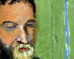
I bought Richard Schmid's book, "Alla Prima." Easily the best book on the making of art that I've read. Conversational in its tone and deep in its treatment of art, truly a treasure from a man who loves making art. I want to quote his discussion of drawing. It's everything that I would want to say, but he says it far better and with more authority. Emphasis in bold is mine... Enjoy :) There is a popular notion that artists are born with an ability to draw, but that isn't true. The impulse to draw is there, but no one arrives in this world endowed with the capacity to graphically depict visual reality. I have never known a painter who was just "naturally" good at it and could do it without serious training. Drawing is a skill that must be learned, but it isn't like swimming or riding a bike. Once you get the knack of it, you can't relax and just let it happen by itself. It takes constant practice and presence of mind. Why? Because it is not a physical skill; it is a mental discipline. It deals with continual variables rather than the repetition of memorized shapes. I always have the fond hope that someday it will get easier, but it never does. Sound drawing always demands great care right down to the last dab of paint.For most of us, the word "drawing" brings to mind an outline of something. This deeply ingrained assumption originates in childhood when we learned to use lines to make pictures. Yet in real life there are no lines around things. Line drawing is only a representation or diagram of our visual world. Painting, on the other hand (the kind I am dealing with here), attempts to create an illusion of that world. Consequently, in this discussion when I use the word "drawing," I mean the size, shape, and arrangement of all the patches of colors that collectively make things look the way they do (and which also constitutes a painting). When you render those patches the right size, the right shape, and with their distinctive edges and color, your painting will look like your subject. If you don't - it won't. It will look different. Drawing is simply measuring. As it applies to direct painting from life, drawing comes down to nothing more than figuring out the width and height of color shapes and then fitting them together. Still, drawing remains very difficult for nearly everyone, which is odd when you think about it because drawing is only the visual element we work with that seems to deal with a measurable and definable aspect of the visual world. The other three elements: color, value, and edges, are relative qualities with generous room for interpretation. Drawing is about specific dimensions. That, folks, is a masterful explanation of drawing. And if you like painting, or want to paint, buy the book. It's cheaper and available in soft copy at his web site, which is where I bought it. |
|
|
|
|
|
|
|