RSS Feed

a playground of art, photos, videos, writing, music, life


You are here


Random Quote

Be obscure clearly.
-- E. B. White


Blog Posts for "betty edwards"

Page Through Blog: Home Page

Blog Archive by Month | Blog Archive by Story or Tag | Search Blog and Comments

Sketches


The boys and I went to a park today. Twice. The first time, Jacob had his old three-wheeling bike. Time for an upgrade - so we went to target and bought a two-wheeler. He'll be my last child to learn bicycling from me. Sigh...

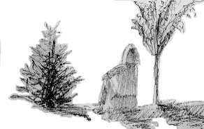
But when we went to the park, I took my sketchbook with me. A woman and her family were at the playground, and I did a fast rough sketch of her and the two trees that bookended her.

I've come to believe that sketching is vital to my art. I need to practice, every day if possible. Earlier in the day, Cub and Nick and I went to Barnes & Nobles and I bought The Ultimate Book of Sketching. It's out of print, but B & N had four copies of it. It's a decent book, not so much on method, but for all of the examples the artists display.

I've finished Richard Schmid's book on painting. Truly great book. I've tried my hand at painting and I've never had any formal training, so I've been reading voraciously to give me as much of the essence of it as I can muster on my own. Major influences so far would be Schmid, a watercolorist named David Becker, and Betty Edwards, who wrote Drawing on the Right Side of the Brain and her book on color. The good thing about the three of them is how much they disagree with each other.

Becker's watercolors are effortless. He's what I would term a natural artist. Obviously, his "natural" ability is well-honed and practiced. He's a huge advicate of sketching and believes deeply in using initial sketches as a blueprint for composition and values (depth of darkness/brightness). He's unafraid to change a picture to get a better composition. He'll add people, change buildings, and completely ignore the picture's original colors to arrive at what he feels is the best and most interesting painting.

Then there's Schmid, whose method is Alla Prima, or paint what you see in one sitting. He doesn't change colors. He paints it as it is, and he's quite ardent about that. Schmid's theory about color is to find a pallete that is true and then learn to blend the colors. He has a fantastic color chart near the end of the book that show how the colors of his pallette blend with each other, and he insists that everyone do this. I see wisdom in this and I'll be doing that myself in the next week or two.

He goes into some depth about form (the shape of objects), value (the shading of objects), colors, and edges (the way in which colors and forms meet each other in a painting). Schmid's compositions are fairly straightforward - the subject of the painting is generally at the center and not surrounded by much else. He emphasizes the skill of drawing, like Becker. But he couldn't disagree more with Becker and Edwards about color.

Becker and Edwards talk about color harmony. Becker's favorite three colors are purple, green, and yellow-orange; you see them prominently in just about every painting he does. Edwards spends a great deal of time in her book on color discussing how we naturally see harmony in certain colors. Schmid says that's all bullshit. He believes that lighting forces everything into a harmony of sorts. For example, moonlight will blend everything into a pleasant harmony under its spectrum. Sunlight, same thing.

I like both perspectives on the subject. I'm too new at this to really have an opinion yet, but again, I'm busy fact-gathering to be as effective as I can be.

Where Schmid really differs with the other two is on the topic of edges, and you can really see this in his paintings as well.

I've browsed a lot of art books in trying to find ones that would help me understand better and enhance my work to bring out best what it is that I can do. Schmid's comprehensive treatment of edges is unique. Even he says as much in his book. Becker goes into edges a little in one book that I have, but I think watercolors are meant to blend more so that oil can. So are edges in watercolor not as important?

I don't know. I do know that Schmid's work is amazing for what it achieves. The idea that he does his paintings, in oil, in a day knocks my socks off.

So I've been thinking about all of this. My version of art training... and now my book on sketching to browse and keep me motivated.

I have noticed that drawing from life is much harder than drawing from a photo. The photo comes with measurable sides and it's easier to get a sense of the shapes. Real life is much more difficult. Here again, this is Schmid's forte. His subjects sit in front of him, whether a landscape or a person. That's brave, in my opinion.

So I'm convinced that I need to skecth from real life more often. The preceding sketch is of a car in a parking lot near where I live. Did I capture it? I don't know - I don't think it really matters. It's like a friend of mine likes to say, it's not success or failure that defines us but the journey.

Now it's time to make dinner on this gorgeous day :)


1 Comment
Tags: drawing | betty edwards | richard schmid | david becker | alla prima
by Brett Rogers, 4/17/2005 5:48:03 PM
Permalink


Constancy


Labels restrict function.

There's another consultant with whom I work who said to me the other day that he would never accept a permanent position with a company. He likes the people and what he does, but he doesn't want the fetters that come with a job description. He can leap corporate hierarchy and talk to managers up and down the chain about anything that he thinks worth noting.

Today, we were struggling with a problem at work that we've had for a while because it occurred to us today that we were constrained by the labels we placed upon the functions. Labels are nice. They quickly convey a complicated idea, but because they are prepackaged, they contain limits.

I'm getting a lot from Betty Edwards' book on Color. She talks of the notion of "Color Constancy," which is the idea that an orange should be, well, orange. But if you look at an orange in the light, it's white and yellow and brown in the shadows. Probably other colors too. But Color Constancy limits a painter from succeeding in their work.

It makes me think of "People Constancy," which would be the idea that people should fit into convenient buckets formed of our experience.

This Constancy thing, it's hard to scrub it from our brains. Betty mentions in the book that one painter in the 1800's would bend over and look at the subject of his painting through his legs, which made it easier for him to see the object as it was and not how he thought it should be. When I paint, I can look at the object and study it hard, but then the minute I turn my attention from it to the paper, my brain takes over and tries to convince me that red onions can't be yellow. In part, I worry about the impression that others might have, like when a child is laughed at for coloring someone's face red or purple. I wonder if that's what prevents people from painting... the impressions of others at their work.

I expect that I limit people to certain expected colors... like when my first graphic for "Left-Wingers" was a burning flag. The concept conveyed a concept, all right, but a very limited concept.

I find that painting has to be wordless. It's hard, sometimes. I wonder if I'm not wordless enough with how I view others. "Wordless" implies listening, I suppose. No labels.


0 Comments
Tags: relationships | betty edwards
by Brett Rogers, 3/23/2005 1:05:26 PM
Permalink


Hue, Value, and Intensity


Betty Edwards writes in her book, Color: "Everything about color has to do with relationships, and the questions you need to ask in order to understand color are all about relationships."

What you see at right is a color wheel. If you start with the three primary colors, and then add the secondary colors (giving you six colors), and then add the color that is a mixture of the adjacent primary and secondary colors, you then have twelve colors.

What combinations of colors please the eye? Studies have found that opposites do. For example, purple and yellow, or red and green. To show that this is true, several people have complimented my current painting, a still life of a red pepper and a sliced red onion. The red pepper is a bright red with a green stem. The onion is purplish with yellow highlights. This was quite by accident on my part - I was simply painting what I saw. But as I step back from it, I do see that aspect.

Artists also find that triads - creating a color and then using the fourth from it and then the fourth again - creates a harmonious mix. Red, yellow, and blue are one example. Orange, purple, and green would be another.

I doubt that it has anything to do with this, but music also has twelve notes between octaves. To create a harmony, you use not the opposite or triads, but rather fifths or sevenths. But there's a rhyme and a reason to understand harmony in both color and music.

So... I wonder how this idea of hue (a color from the color wheel), value (light or dark), and intensity (bright or dull) transfers to harmony in friendships and marriages. I'm too tired now to consider it more, but I'll be thinking of it...

ETC: More in the comments...


2 Comments
Read the whole story of "Drawing and Painting"
Tags: betty edwards | color | painting
by Brett Rogers, 3/23/2005 12:51:19 AM
Permalink


Discovery


One of my favorite bands is Rush. I have no idea what their current song list sounds like, but when I was in a band oh so long ago, all of us in the band loved Rush. I played bass, so I mimicked Geddy Lee, my drummer was a spot-on Neil Peart, and Kelly channeled Alex Lifeson with amazing attention to detail. I remember the first time that we rehearsed Spirit of Radio. If Rush played the song as an instrumental, we did it justice. We were pumped after that!

Today, I'm listening to a long playlist on my laptop while working and Time Stand Still comes on. It's a good song and I've listened to it a great deal. But today, I caught something that I'd not heard before. About midway through the song, in the chorus, Geddy riffs this very subtle but very fat melodic bass line that has me double-take and replay that section a few times. Never heard that.

The Sundays have a song like this called She from their album Static and Silence. David Gavurin's guitar work throughout the song is varied and surprising. Enjoyable many times over, just to hear what he's doing.

Times like this are like walking along a favorite and frequented path, but today noticing a break in the bushes that leads to a lovely garden. One that you had never noticed before. Or like learning that your lover has an interest in photogrpahy and is quite good at it. You wonder how you missed that in 10 years of being together. But it's like discovering them all over again.

I never listen to lyrics much. Most lyrics are fairly nonsensical or trivial. They really don't do much for me, although there are a few exceptions. A turn of phrase or a deep wisdom conveyed in lyric will catch my ear. But mostly, I listen for the music. I can write code and listen to music at the same time with no problem. The music happens for me in a different place than my programming. The separation of right and left brain activity, I suppose.

But all of this has me thinking... that "aha!" sense is something that we all enjoy. I've been studying Betty Edwards' book on Color and I've been looking at others' works of art... something that I hope to do one day is to somehow capture in my painting that possility for "aha!" To somehow bury an Easter Egg into the work so that the viewer can one day spring off their couch and study it closer and marvel at how they missed something. I think if I can do that someday, I'll have done in art what I want to do.

And I suppose that this desire of mine is probably what will lead me to larger works. The larger area will allow me more detail and play within the work.


0 Comments
Tags: music | rush | the sundays | betty edwards
by Brett Rogers, 2/16/2005 1:59:30 PM
Permalink