So, after a year of selling my artwork via greeting cards, here's what I've learned: 1) The cards are generally regarded as beautiful. This is a good thing... it doesn't guarantee a sale, but it's a good start and it does generate interest. 2) Big cards intimidate the crap out of people. For two reasons. Reason #1: will it need two stamps? I get that question asked of me all the time. 3) Reason #2: People aren't that wordy! They look to me, the greeting card vendor, to make communication easy. The big cards are too much white space. 4) Words sell. I mentioned this before, but people, in general, like lyrics over instrumental music. 5) The small cards are more popular than the big cards. All that beauty in an itty bitty living space. Which is good and unique, but they can't be sent. So combining all of these lessons learned, I'm working on revising my cards to the smallest sendable worded card that I can. Here's the first 3½" x 5" card: (Note: I've updated these images based on feedback from a few people...) 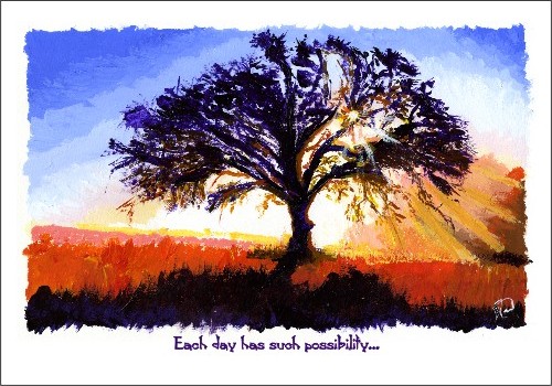 And the text inside:  And another one... 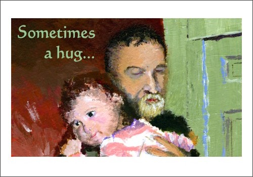 And the text inside: 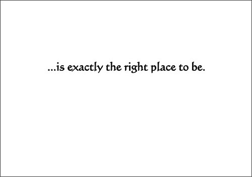
|