RSS Feed

a playground of art, photos, videos, writing, music, life


You are here


Random Quote

One great use of words is to hide our thoughts.
-- Voltaire


Blog - Blog Archive by Month - Blog Archive by Tag - Search Blog and Comments

<-- Go to Previous Page

Wax On, Wax Off


Lots of things going on in my personal life, and so I'm up late trying to accomplish one thing that I wanted to do today, which was to work on my palette color selection and mix some paint.

I've learned from reading and from practice that it's not hard to mix any color that you need, but it is hard not to get all excited about the 89 colors that paint vendors push at you. No one actually needs all of those, and with a bit of practice, in theory, a person should be able to mix any color from a good selection of base colors. Tonight, I worked orange. I mixed it with every other color in my initial palette and was surprised by the results.

Here are the colors that I first selected in my palette (plus white and black, not shown in this picture). Orange is on the left.

Now on the top row, here are the same colors mixed with orange, with white and black on the far right. The original colors are on the bottom row.

What struck me about this is how similar the results for the greens and for gamboge and yellow (2nd and 3rd on the left).

So do I need them? I tried to recreate gamboge (yellow-orange) and sap green (the green on the left) with the other colors. Here's how I did:
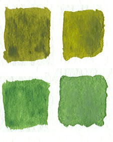
I used viridian, a bit of blue, and yellow to reproduce sap green. I came real close. Then I mixed it with orange to reproduce the blend and that too was very close. So I don't need sap green.
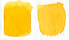
And the same results with gamboge, although I like gamboge as a color.

One last thing that I want to point out. Richard Schmid, in his book, asserts that colors harmonize just fine when blended with every other color in a palette. So here are the colors I made by blending every color in my palette with orange.

I have to agree with him. Just having the same "base" color for every mixed color brings out colors that all harmonize with one another. Color wheel be damned.


Tags: palette | painting | richard schmid
by Brett Rogers, 4/21/2005 2:25:46 AM
Permalink


Comments

If I weren't completely out of money, I'd run over to the art store on MLK and snag some water colors!! Or oils! But I think water colors are much cheaper..


Posted by Stefanie, 4/21/2005 1:21:22 PM


Watercolors are definitely cheaper. About $2.00 a tube, and the paper is only about $5 for a decent (though small) pad of paper.

I've spent my lunch at work mixing more colors and painting more squares. I've done ultramarine (blue) and viridian (bluish-green). I'm getting colors I never would have expected. Like red and viridian don't yield a brown so much a wine purple. Go figure... I knew there was blue in the viridian, but who knew? This is the most instructive thing I could have done...

I'm also learning a great deal about the strength of the paints. Some of the tubes, like my viridian and ivory black, are "drier" than the others and require a bit of water to apply them. Therefore, in their watered-down state, they are easily over-powered by other "wetter" colors. It's tough to know the right amount to get an even mix. I could spend weeks just doing flavors of this stuff...

I think I'm going to redo this on a larger scale (maybe an 8X8 square) and in a more organized manner.


Posted by Brett Rogers (http://www.beatcanvas.com), 4/21/2005 1:34:30 PM


Add Your Comment:
Name (required):
Web Site:
Remember Me:   
Content: (4000 chars remaining)
To prevent spammers from commenting, please give a one-word answer to the following trivia question:

What country borders the United States on the north?