|
 |
RSS Feed  |
a playground of art, photos, videos, writing, music, life |
|
|

You are here
|

Creativity!
|

Get it!
|

I like it!
|

Fun stuff!
|

About me...
|
| |
|
|
|
|
Random Quote
We work in the dark - we do what we can - we give what we have. Our doubt is our passion, and our passion is our task. The rest is the madness of art.
-- Henry James
|
|
|
|
|
|
|
|
|
|
Blog - Blog Archive by Month - Blog Archive by Tag - Search Blog and Comments
|
<-- Go to Previous Page
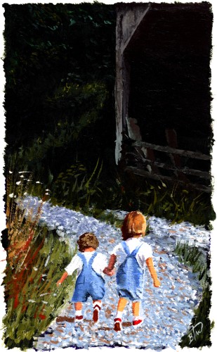
Friends Hold Hands (Done) |
I tweaked the words and finished the painting. Of course, I reserve the right to modify it later, but I like it.  This will be my first card with words inside: I'm so glad that you are part of my life.Simple is best, I think. |
|
|
|
| Comments
|
I think "together" needs to be centered...just seems like it's hanging out there. Also, there is something about the grass/brush in the foreground that is off. Maybe if you added some dark green in it (the brush in lower left corner) It seems like it doesn't blend with the rest of the painting. I think the girls would stand out more as a result. I do like how the girls turned out and the simple phrasing of the card. Simple, but says so much.
Reminds me of Kelley and I when we would be walking on my grandparents' farm in PA. :-) |
| | Posted by Anonymous, 8/1/2006 12:57:08 AM |
|
|
I slept on it so that I could look at it fresh this morning and found that the text was off, so I aligned the text on the left, where "together" is aligned on the right. More balanced. I like "together" where it is because I think it emphasizes the word, and in the painting it's in a dark space. If I centered the word, it would be over the shed, which detracts from the word. Plus, I don't really like centered, which was why I ditched the first Heart painting I did. Off-center works better for me. As for the grass, I kinda like it, so I'm keeping it that way. I've already had someone tell me that they want this card, so it pleases me to hear that it strikes a chord with you too. |
|
|
Hmmm...good point about "together". It does look better over a contrasting dark color. I can see where it would be more washed out if it was centered. Glad you are already selling this card. I like that it can be used for any time of the year and for a variety of receivers. Can't wait to see the next one! |
| | Posted by Anonymous, 8/1/2006 9:20:35 AM |
|
|
Add Your Comment:
|
|
|
|
|
|